My role: UXR & UX Design
Including: Information Architecture, Card Sorting, Prototyping, System Design, User Testing
Client: Personal project
Project type: Website
March 2023
Stage 0: First Impressions
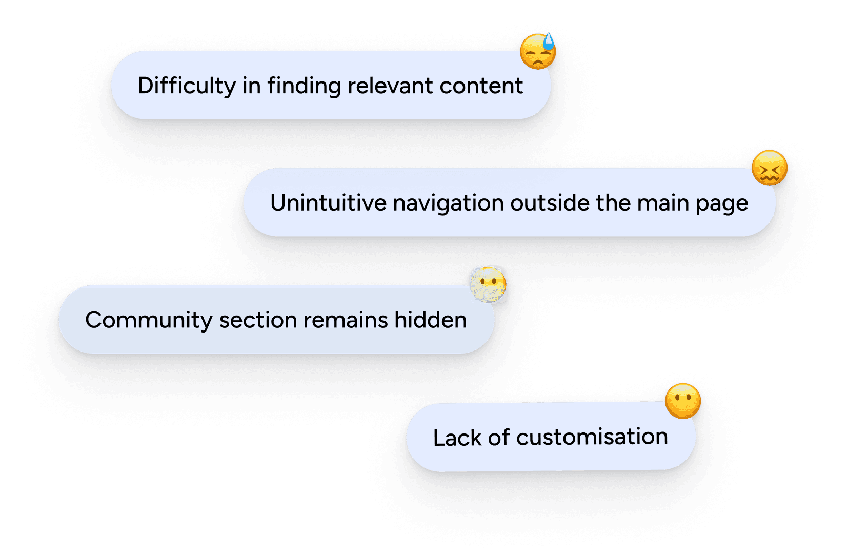
There are few sites matching Mubi’s offer. As many other users, I’ve discovered some of my favourite films because of it. However, a couple of weeks in, it’s easy to spot the limitations causing people to leave, partly due to the way certain parts of the web are conceived and a lack of actualisation of the service to meet current needs. The assumptions in the right-hand show the intuition guiding my first steps approaching the problem.
Note: Mubi is a strong product with clear differentiators built within, yet it would benefit immensely by investing on improving any of the points above. Providing a better user experience is key in reducing the churn rate and making customers more appreciative of the platform possibilities, that are already a comparative advantage.
Stage 1: The insights’ hunt
On “Mubi and the curation model of a video on Demand”, Mattias Frey describes Mubi’s audience as predominantly male, more likely upper-middle class and well-educated, likely to be interested in wider art film culture. Mubi’s VP of Marketing in 2017, Amy Basil, said users were people “interested in all manner of cultural areas, not necessarily just fans of cinema”. As I later found out, these users are also hard to reach. When I started the project, I was under the impression that Mubi was more widely used than the study revealed.
I conducted a survey with Spanish streaming services’ users, and for every 8 Netflix users there was only 1 Mubi user. The same study revealed Netflix and Filmin to be considered the easiest platforms to find and discover content. Unsurprisingly, Netflix, HBO and Prime Video came out as the most used services respectively, but given the niche content Mubi offers, Filmin is what Mubi should be watching for. Thus, I decided to conduct a round of interviews with Filmin die-hards and find out what made it so special.

Both interviewees -in their late 30s- shared the thing they loved about Filmin was its Classics’ catalogue and hard-to-find films. The features they used the most were Search Bar, Lists and Catalogue.
When asked about Mubi, one of the users said he barely knew it, the other had never heard of it. After explaining Mubi’s features, both said they would totally use them and felt motivated to try it.
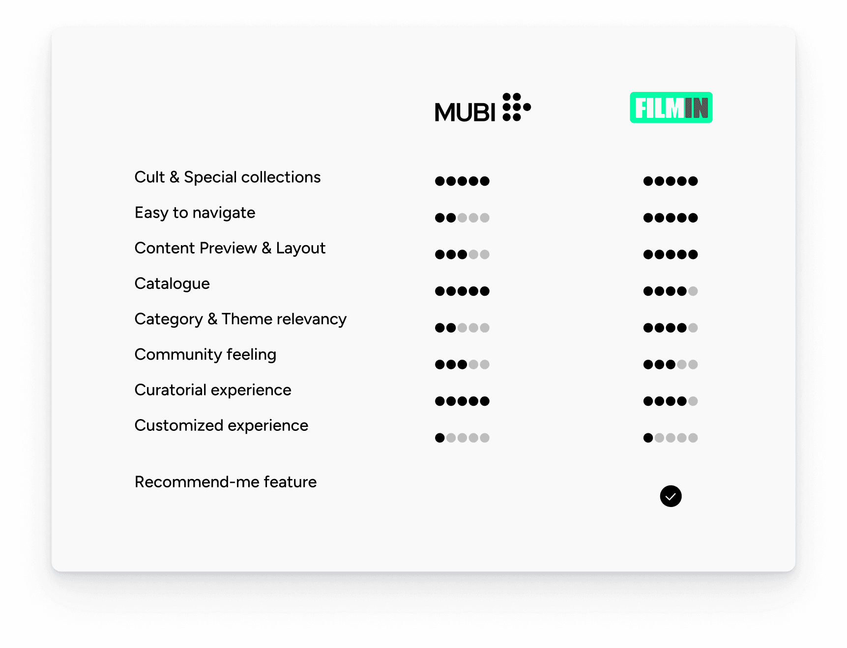
While analysing Mubi’s competitors, I fully understood why Filmin users were so happy. It scored top marks in Cult & Special collections, Easiness to Navigate, Content preview quality and Layout, Catalogue accessibility, Category & Theme relevancy and Curatorial experience when compared with other services like Netflix, HBO or Amazon Prime. Filmin provided their users with a nice searching, finding and discovering experience from beginning to end.
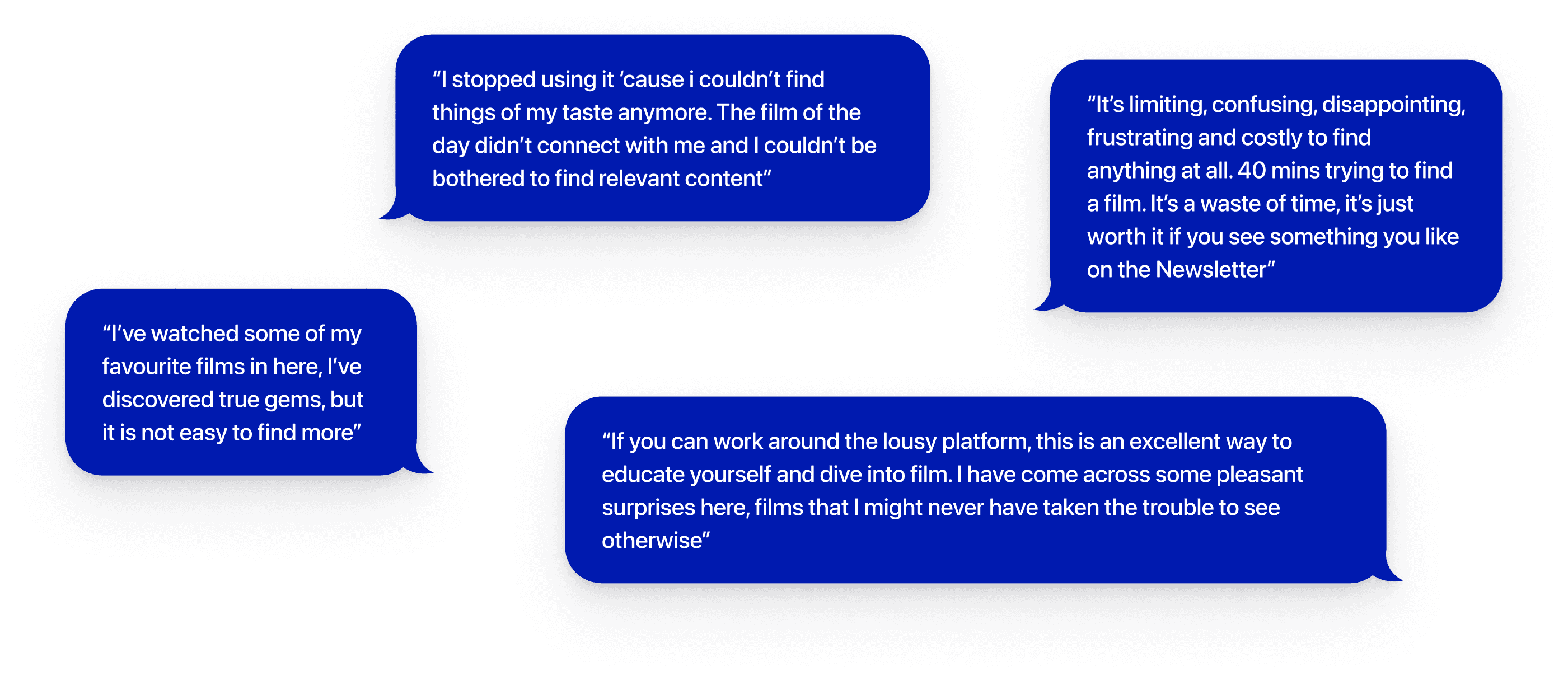
“Limiting, confusing, disappointing, frustrating and costly to find anything at all. 40 mins trying to find a film. It’s a waste of time, it’s just worth it if you see something you like on the Newsletter.” This is the experience of a now ex Mubi user. He explained “I stopped using [Mubi] ‘cause I couldn’t find things of my taste anymore. The film of the day didn’t connect with me and I couldn’t be bothered to find relevant content”.
Another Mubi user, says finding new content is a “tedious and demotivating process”. She’d love to see more relevant categories and personal suggestions like so many other platforms provide. These insights match the ones found in online reviews.
It’s also worth mentioning the 2 main devices from which interviewees watch movies are primarily Laptop (Mubi’s website) and TV.
Stage 2: Building the right thing
So if Filmin is king of niche VOD in Spain. Then, what is Mubi to do? There is one big differentiator that Mubi is not fully utilising; their community. Mubi and Filmin’s users have pretty similar profiles, they’re both passionate, opinionated and are keen on sharing and discovering through other likely-passionate individuals.
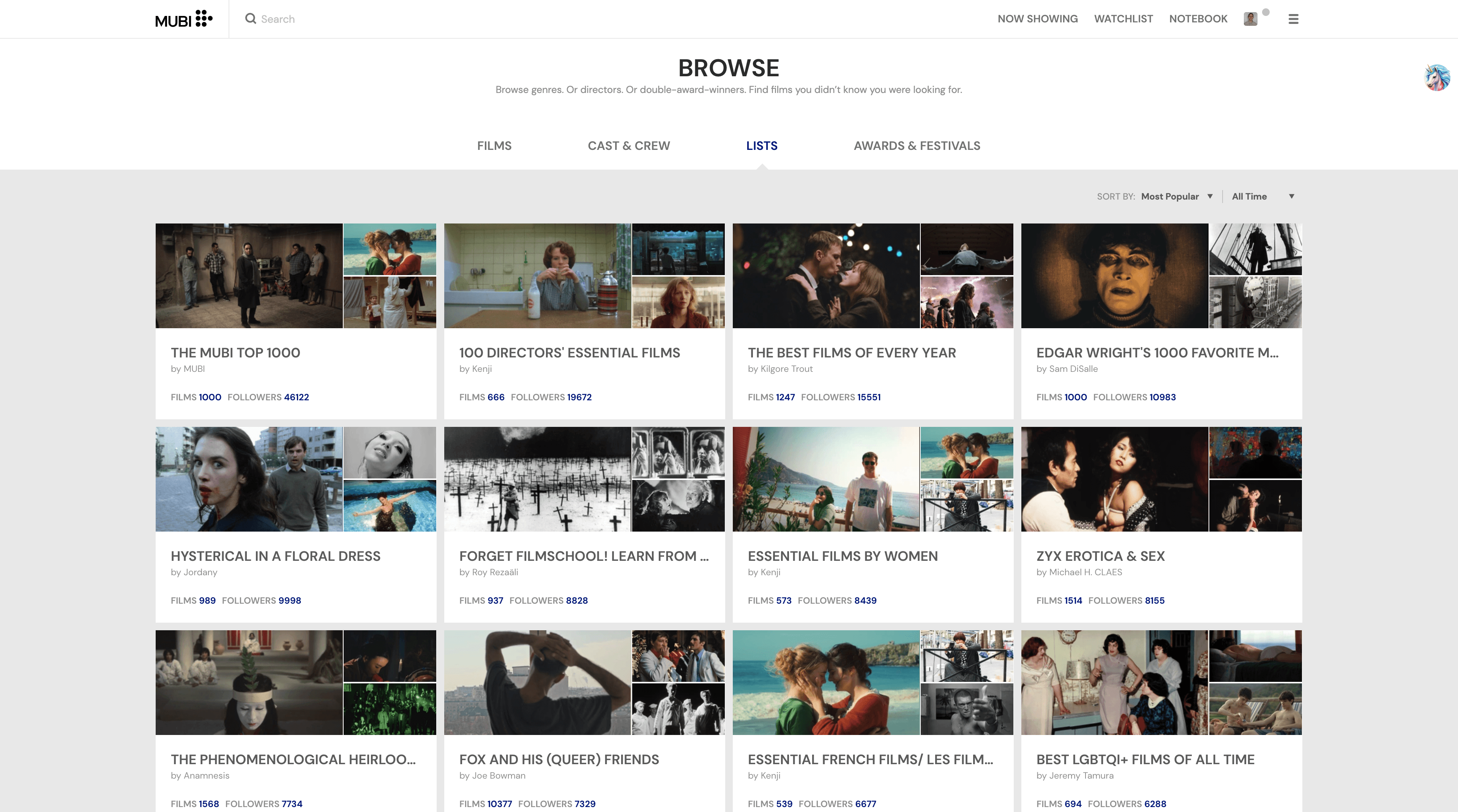
They’re both Letterboxd material. Mubi was already conceived with this sharing in mind. There are lists created by users that other users can follow and a review system where people really invest in elaborating on their critics. Yet Mubi’s community is a highly neglected, without any major updates in the recent years.
During interviews, all users mentioned trusting mostly friends’ film suggestions and critique blogs or podcasts, as well as being attracted to the cast involved or the film’s period of time.
With the potential existing on its Browse section or in Community, Mubi could provide top value for these users. By rebuilding these sections in a more accessible manner, the finding process would be less time-consuming and more enjoyable, having a huge positive effect on existing and potential customers and the company, by reducing churn and experiencing growth.
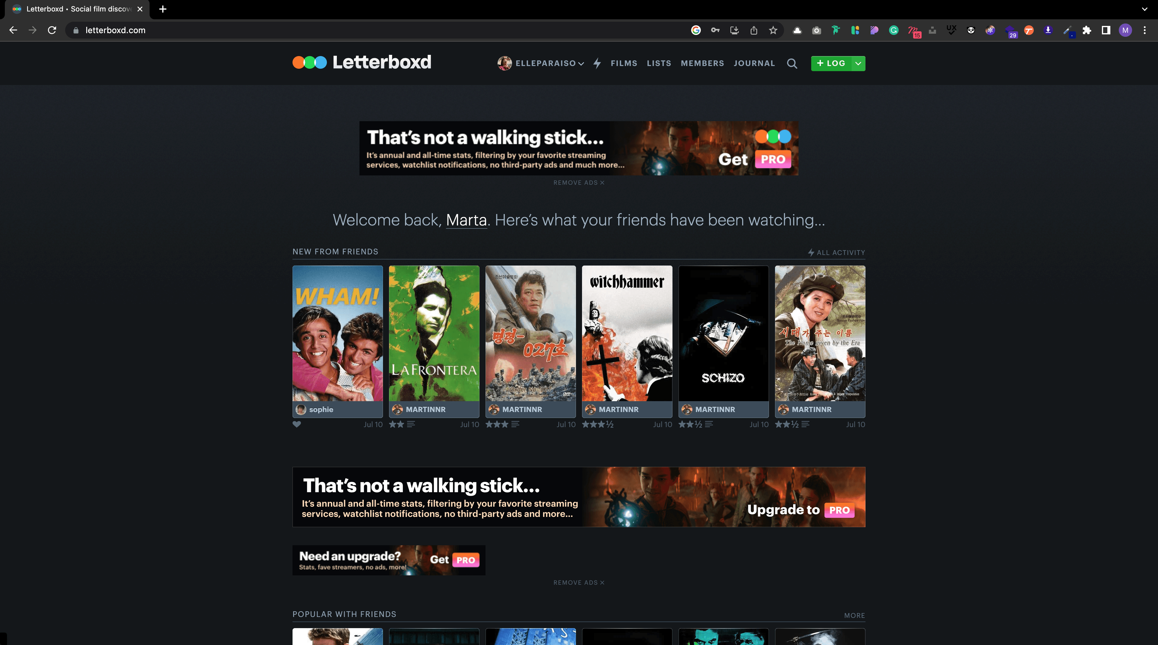
Yes, I’m talking Customisation. Even if Spotify or Netflix suggestions aren’t always spot on, it’s something users are used to have, if only just to check at the end of the day when they’ve no energy left to spend half-an-hour choosing.
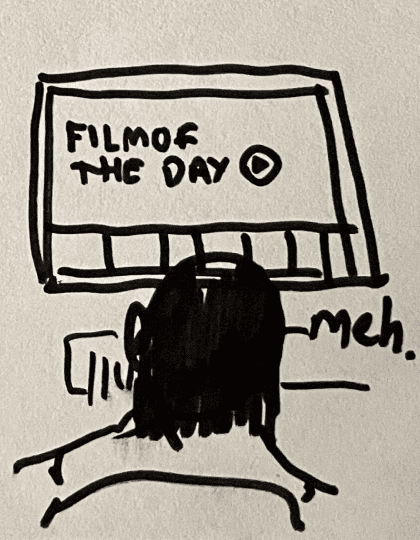
For the ones that haven’t used Mubi, it has a daily recommendation curated by their editors called Film of the Day (FotD). During interviews, Mubi users confessed this was a big plus in the beginning, as it was an easy way to rely on something decent without wasting any time choosing. However, as days went by, users weren’t always motivated by the Film of the Day, and when being confronted with the selection process in the rest of the web were left disenchanted with the process. “Categories were abstract, some films were repeated on several categories and there was a bunch of films that appeared in the catalogue but weren’t available to watch”.
Truth is, FotD is not good enough for everybody, users still need effortless ways to find films they might like. 80% of the surveyed streaming service users enjoyed tailored content and found it useful. Mubi would be wise in catching up with customisation. Given the amount of info it has from users’ watchlist and rating history, it shouldn’t be hard to filter semi-accurate personal picks.


*Prime Video and Disney+ Personal Recommendations
After balancing in all research insights and the capabilities of the existent product, I decided the best way to start off was by improving what was already there. Since, the issues brought up during interviews involved Mubi’s web version, I figured I’d focus on making it more user-friendly by remodelling the Search-Find-Discover experience and adjusting navigation and IA.
I conceived the Homepage and Lists to have a more flexible setup, letting users decide which content they find relevant by making the home section their very own.
Community will be enriched with a new feature that aims to boost engagement and gain new users by WOM. It’s called “Friends’ Recommendations”.
The Profile will have a new layout, promoting a more public image, and users will be able to mark their favourite actors, directors, etc. to receive updates whenever there’s new available material on Mubi.
Finally, the Search bar includes a new feature easing out the process of finding a film’s similar content in a click.
Feels like watching a movie
Decides the platform
Stage 3: Building the thing right
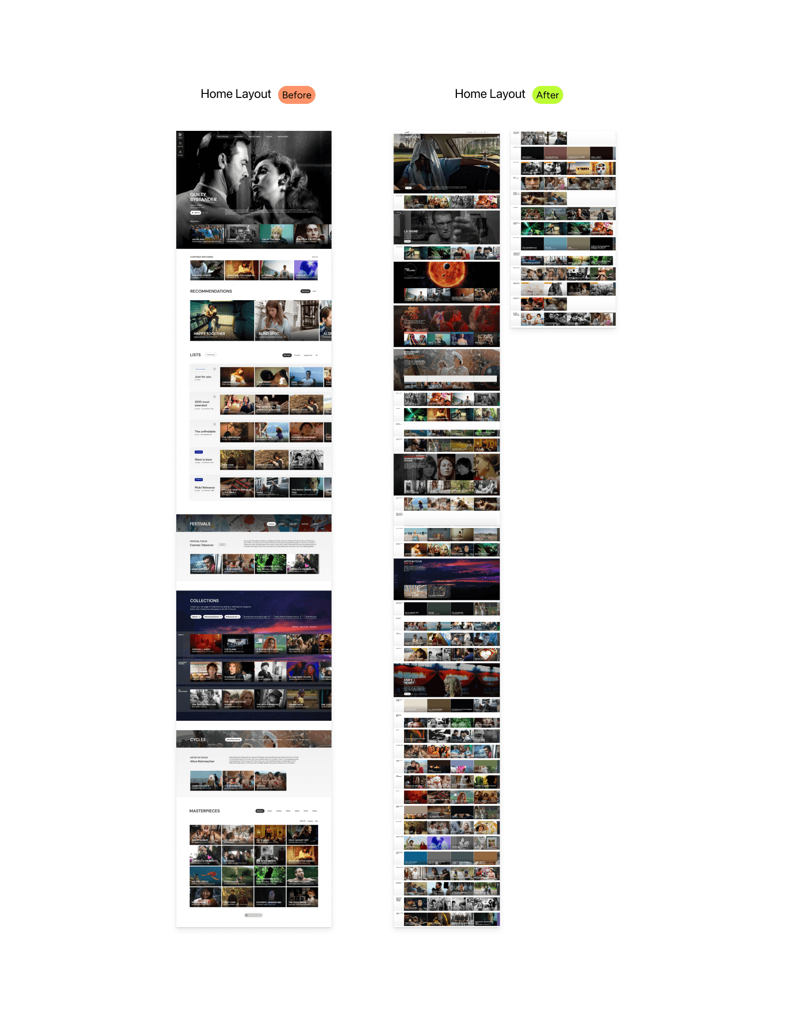
If Mubi’s discovery experience isn’t great it’s partly because of the home section. Many users never actually leave it, and rely on it to just find something of their taste. Thus, it might be tempting to think a fuller homepage with loads of content might be what people need. However, only 1 every 4 users find the endless-scrolling model useful to find relevant content.
Until now, Mubi’s filled their Homepage with over 40 categories displayed in vertical scroll mode. According to survey and interview results this is far from ideal, in fact I’d say it’s detrimental to a fluid user experience. It’s very time consuming and seeing so much content at once can trigger the Analysis-paralysis for many. We humans, don’t choose better the more choices we are given. So why not create personal spaces where users can preselect content that interest them and filter out what doesn’t?
This would declutter Home, and it’s getting a step closer to make the discovery and choosing process easier by limiting the amount of content users are exposed to.
mubi.com
Friends’ Recommendations
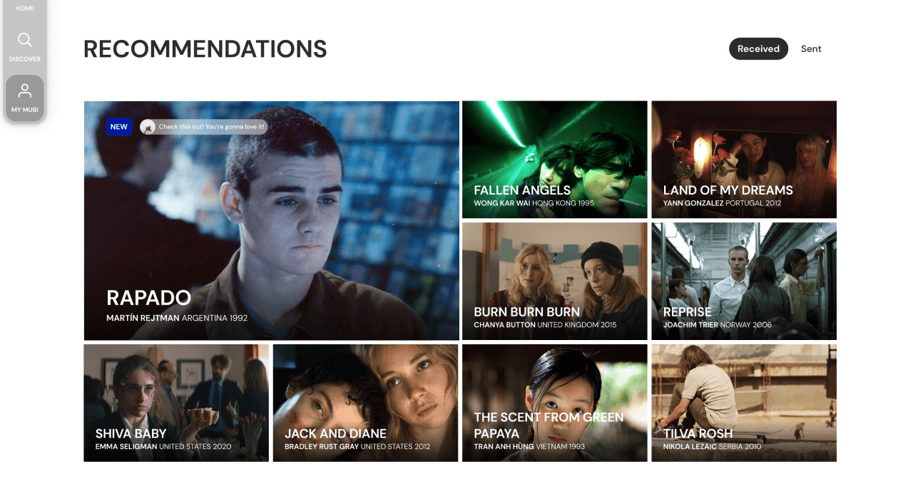
Both Frey’s study and the users interviewed, suggest Mubi’s audience to be most influenced by a Critic’s review or a trusted friend recommendation. Utilising Mubi’s network potential, friends’ recommendations were added to the homepage.
This home category shows all the received film recommendations by friends or other users, ready to be watched, shared or added to the watchlist for later.
This simple feature aligns with Mubi’s vision of human curation and works towards reactivating Community and engagement within existing accounts. It makes the platform more personal and increases findability of relevant content.
Lists & Smart lists
The existing lists were created to give users the power of curation within Mubi’s community. Lists can be followed by users and include both Now showing and unavailable films. It’s a great way to connect with users while enriching one’s taste.
The only problem is that, as it happens with Community, Lists are widely unknown by most users. There are few lists in the homepage, but there are so many categories that often they get lost in the crowd. And the rest are only accessible through Browse, also hidden in the hamburger menu.
In the new design, Lists are a key part of the homepage customisation. “My Lists” displays the followed lists, plus a bi-weekly curated list for every user “Just for you” and Suggestions of other community lists the user might enjoy. Lists can be removed from the homepage in a click to make space for more relevant ones.
The last update is that Lists can now be made Smart to include Recommended films matching the list content. This is especially useful when creating new Lists and finding more content alike, or when most films in the list are not available.
mubi.com
*List management in Homepage
mubi.com
*Adding a film to a new Smart List
mubi.com
Remaining Home sections
To keep homepage’s choice selection “finite”, I did a card-sorting exercise with a few users to determine which categories they felt belonged in home vs. catalogue vs. profile. Together with the interview insights, that gave me enough information to limit the rest of the home sections to Festivals, Collections, Directors Cycles and Masterpieces by decade.
“Collections” allows the before endless categories to be simplified to the user’s taste. The user can select and deselect which thematic collection they want to be displayed in their homepage. By grouping them in a section they’re easier to access and filter, instead of finding them all along the page, meandering around other sections.
Mubi’s catalogue is an added value, there’s so many relevant filters that you’ll never get bored browsing. The problem with is that it’s nowhere to be seen in the landing page because it’s hidden in the hamburger menu under “Browse”. Users don’t even know it exists.
The low-budget solution would be to create a button on the top-bar menu or include it in the Search bar. However, I decided it would be more interesting to reframe it as the new Discover section, devoting enough space to display the catalogue’s content by breaking it in different sections, visible at a glance.
This way, we honour the possibilities Mubi’s available and archived catalogue has to offer, making it readily accessible for users to appreciate.
There’s the main search bar with filters and film result page below. And to the left, another 4 sections Festival and Awards, Cast and Crew, Lists and Users.
To Genre, Period and Country filters, I added Themes. As this is something that is already being to create collections, I assume it could be utilised without a significant cost to provide a more accurate discovery experience.
The access to the Notebook has relocated to the Discover section as another source of inspiration.
Catalogue Section
before
Discovery Section
After
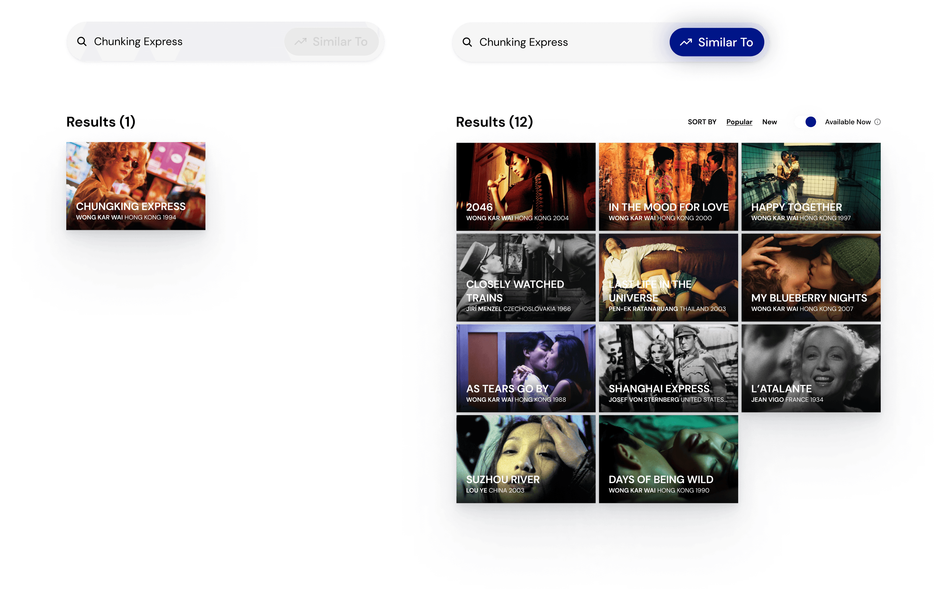
The “Inability to find more content alike” was a common struggle between Mubi users. This is possibly an issue with many causes. Some of them, I’ve tried to tackle through a customised homepage, new navigation and a discovery section. However, there is something else, more “literal” you may say, that could come in handy while doing quick searches on available films.
The “Similar to” Search bar feature optimises the search process by providing the fastest way to check more relevant content referencing a film. Even if the film you’re looking for is not available to watch, “Similar to” shows similar films that are.
Profile Section
before
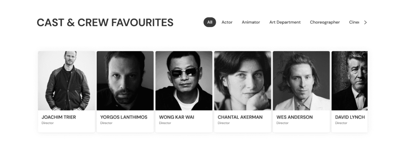
The profile’s been reimagined as a personal homepage summary, showing the user’s latest activity and preferences. It displays their chosen Lists, received and sent Recommendations, Viewing history, Watchlist, Ratings and reviews and Cast & Crew favourites in a one-page.
It’s built to enhance the Recommendations section, and resembles more of a social media profile, a place anyone interested in the user would be willing to explore, rather than a tracking section of watched material and reviews left. This focus on social, will reinforce the community feeling by making users more open to one another. The profile acts merely as a presentation letter.
Users can adjust the level of info they’d like to share with followers users and others in privacy settings.
My mubi
After
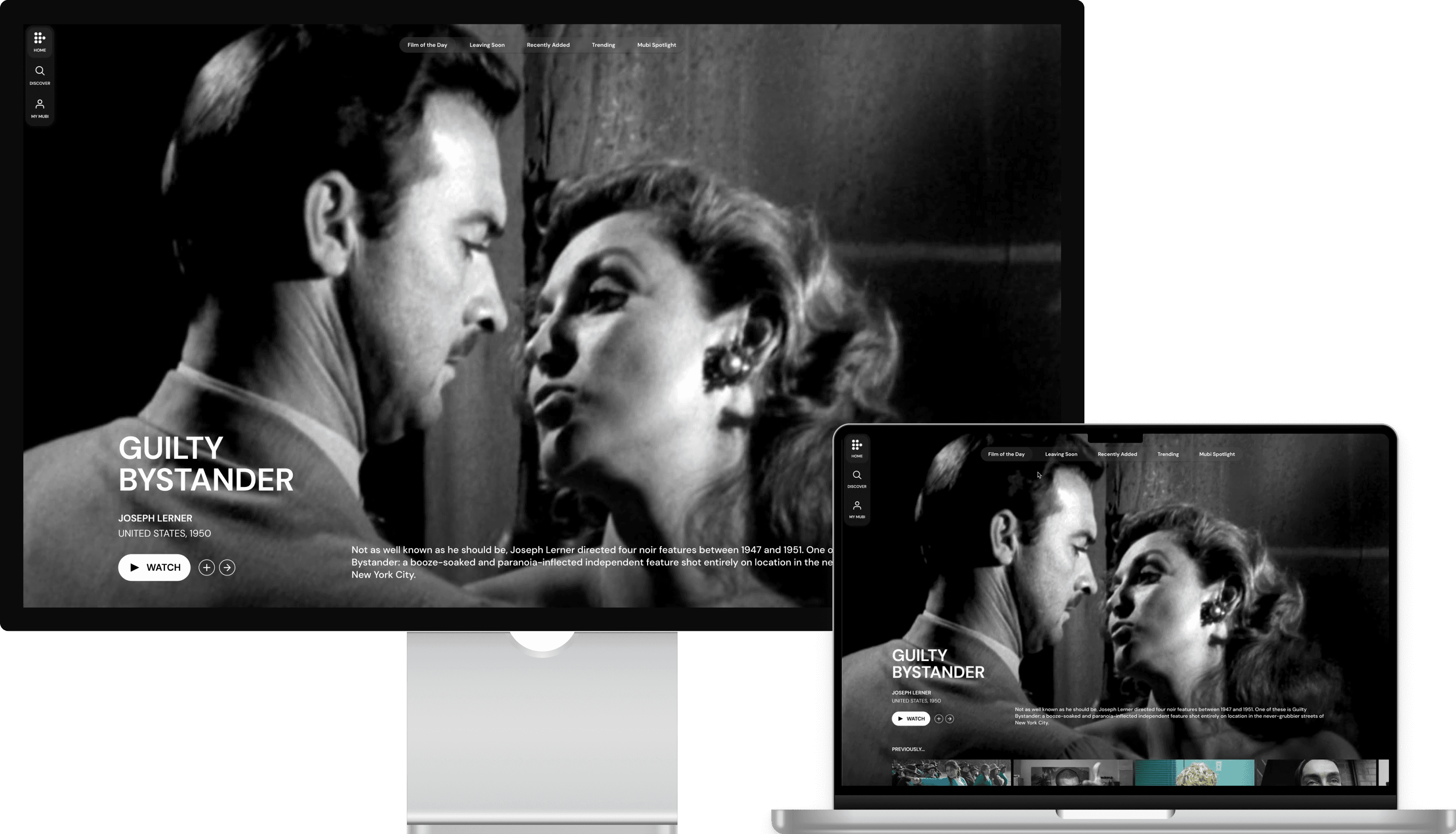
Genre, New or Popular came out to be surveyed users’ favourite way to filter through films and it seemed appropriate to make them right as accessible as Film of the day. My solution to this was creating a top horizontal menu promoting easy and tempting options, these included the said Film of the Day, Leaving Soon, Recently Added, Trending and Mubi highlights.
As for the main menu, a floating option seemed to be the least intrusive. With 3 sections: Home, Discover and My Mubi, it’ll allow users to seamlessly access Mubi’s whole potential. My Mubi section contains the rest of the relevant settings following a more app-ish structure, leaving the main menu buttons to focus on what matters most.
mubi.com
*New Navigation Menus
Note on visual changes: The goal wasn’t to change Mubi’s appearance, considering that its neat looks were always appreciated by their users. So, Mubi’s identity’s remained mostly untouched and the new layout has aimed to respect the same design principles.
Stage 4: Measuring results, next steps, limitations
To analyse these measures’ success, I would suggest tracking Usability and Findability, User contentment and New users with the following:
Usability & Findability
Search Completion Time (from landing until playing a movie)
Section click rate: on Lists, Collections, Discovery, My Mubi
Follow rate: Amount of new profiles followed
User Satisfaction
Net Promoter Score
Feature usage: interaction with Similar to, Recommend a friend, Smart lists
Engagement rate, Watchlist increase rate
Average Film ratings: For films found in Smart lists, For you and in general
Churn rate
New Users
Acquisition Cost
Conversion rate
Trimester review on Section, Feature and Page results; analyse the best and worst figures, and further research to understand why.
In the case that “Recommend a friend” feature is successful, it would be interesting to get more insights on whether actual users would appreciate a bigger community presence in the platform. If so, grouping Users, users’ Lists and Recommendations within an independent space under the name Community in the Discover section seems adequate; giving it a name would increase user recognition.
A good time frame would be gathering data during 3 months and work for 3 months implementing changes every half a year if necessary. Constant research, being in touch with users, understand their changing behaviours and drives is key to provide a top-notch experience.
Insights upon which design and strategic choices were made came from a Survey (n=28), 4 interviews with users from Filmin and Mubi, Frey’s study (2021) and Customer feedback from internet reviews (blogs, amazon, apple/play store). However, even with limited resources, results were quite consistent regarding Mubi’s poor platform performance on the search process.
Several people were involved on the user testing of the final product, but just two of them were actual Mubi users, and both of them were Spanish. Given that Mubi shares the same web structure for all countries, it would require more research, especially interviews with international users before implementation.
The goal of this project was to improve Mubi’s user experience and tackle existent problems within the platform. I tried to achieve this by focusing on reducing the Search-Find-Discovery time and making customisation and Friend Recommendation part of the process, with a simpler navigation where nothing relevant is hidden inside secondary menus.
This project couldn’t have been accomplished without the generous collaboration of interviewees, mostly internet strangers kind enough to contribute to the cause. Frey’s useful study , filled with insights, and the support and patience of friends and family during the process.
1
New Navigation menus
A more compact Homepage: adding customisable content in Lists and Collections, “Friend Recommendations”, “Smart” Lists, and a “For you” list.
New Discovery page: displaying all key elements in a movie search quest (cast and crew, festival highlights and awards, user profiles), genre, year, themes and country filters. The “Similar to” feature.
New Profile layout: My Mubi. Including cast favourites and Recommendations displayed publicly together with reviews, Watchlist, selected Lists and history of watched movies (unless privacy settings).
Stage 5: Prototype in action
